Visual Hierarchy
Fitbit LLC.
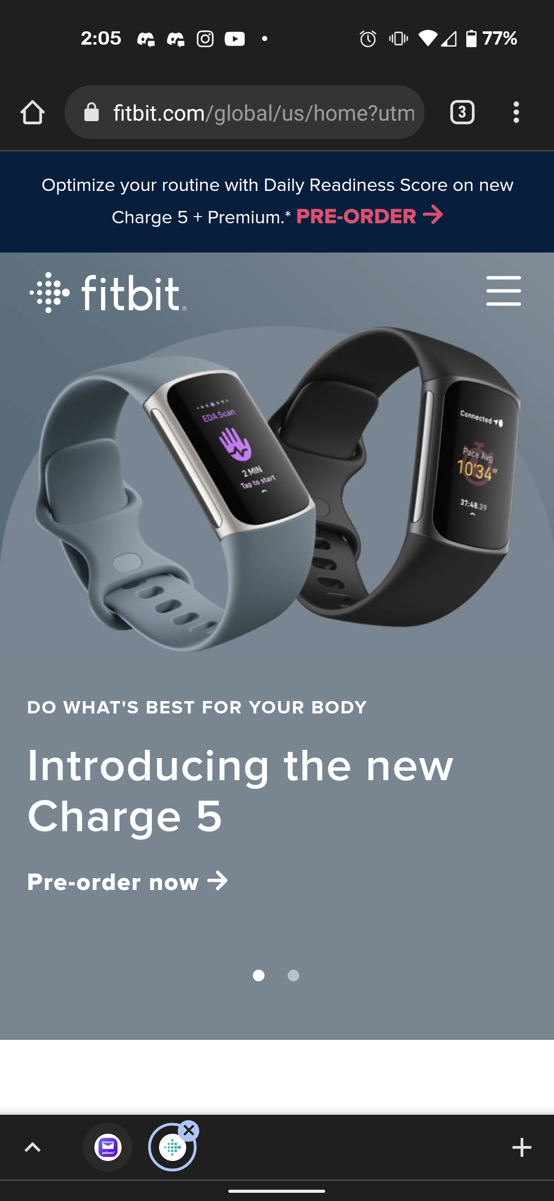
Fitbit LLC. follows the visual hierarchy principle of web design well. The product and the information they want users to see the most is right at the forefront.
Rule of Thirds
Idaho State University
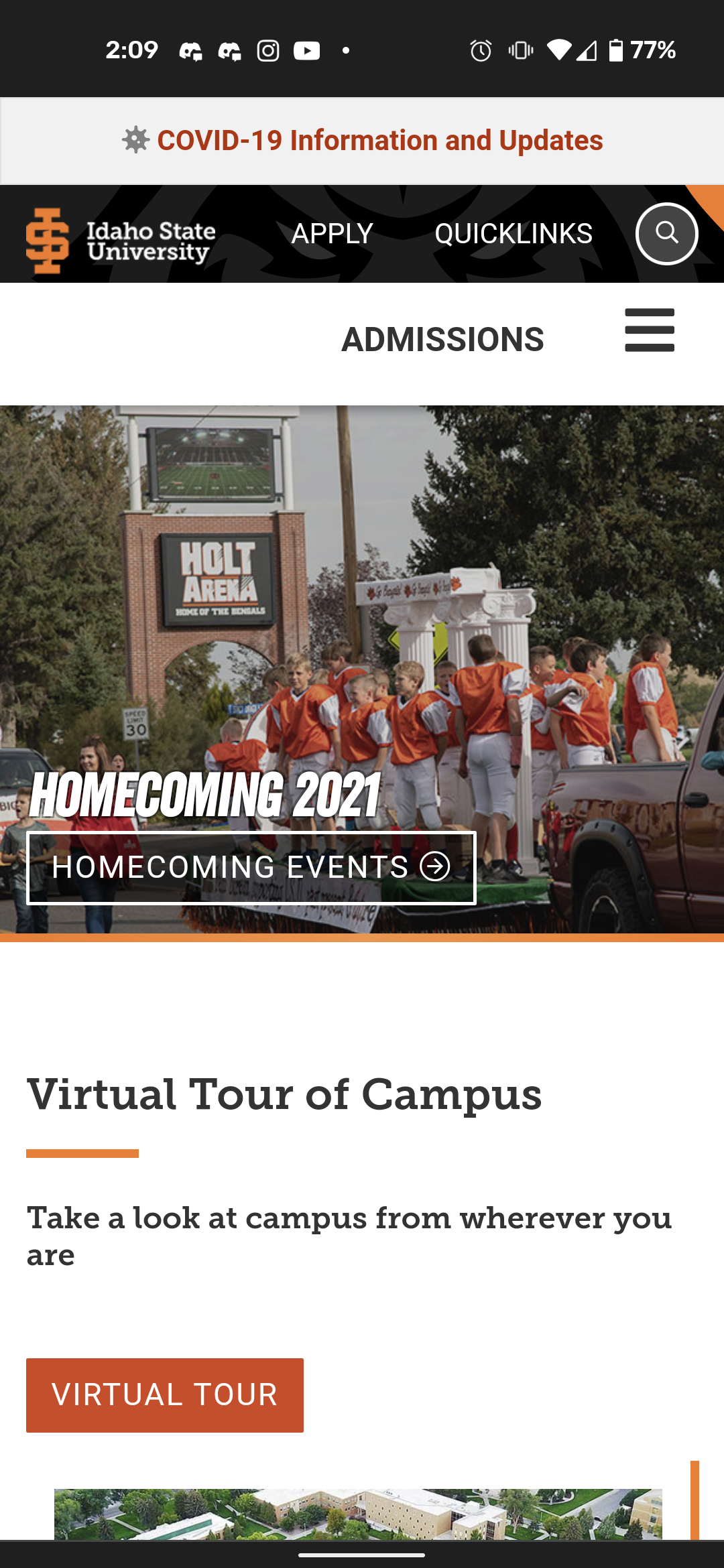
Idaho State University does a great job of distributing their web content evenly throughout a 3x3 dimension.
White Space and Clean Design
Bear Creek Distillery
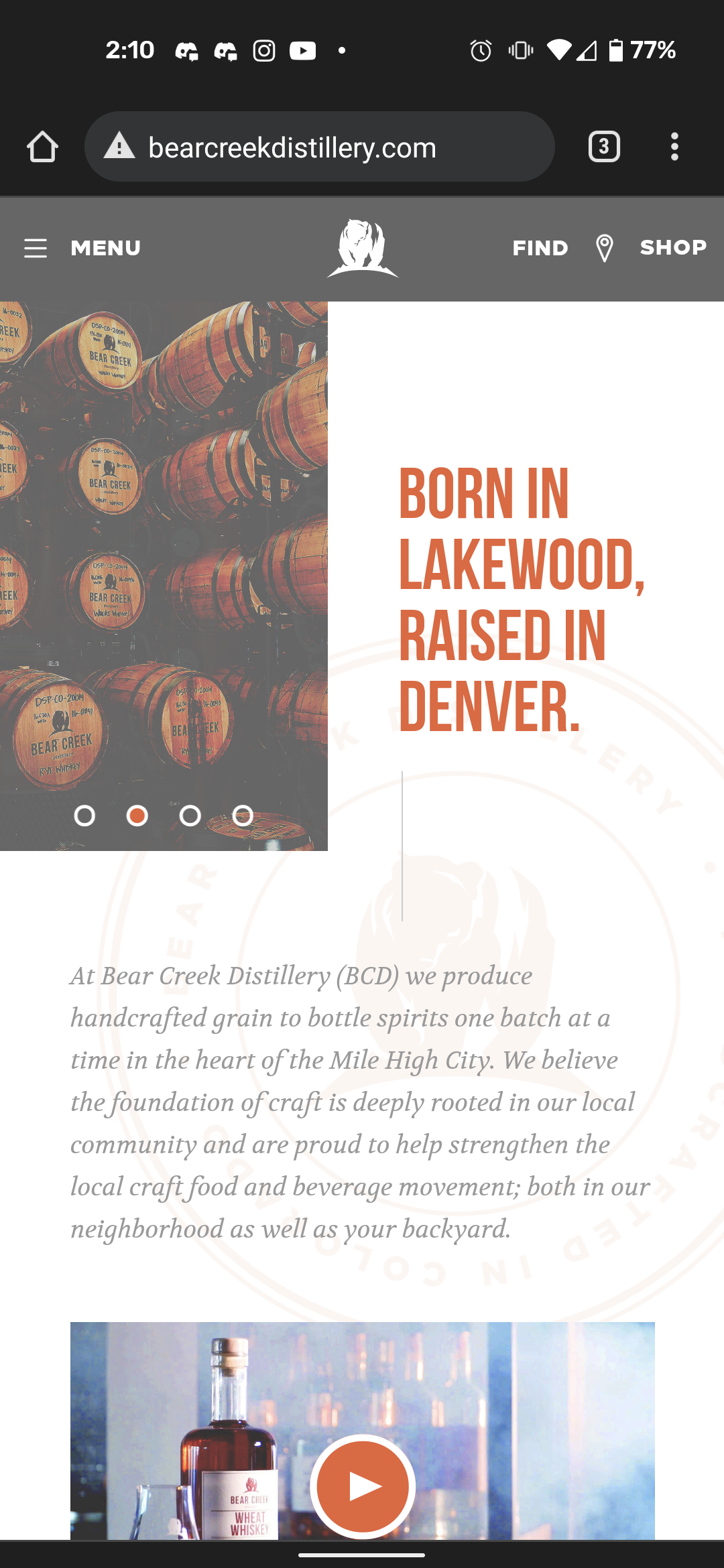
The use of white space is fantastic by this company. They don't have any empty, obscure looking parts to this webpage. It all looks neat and well organized.